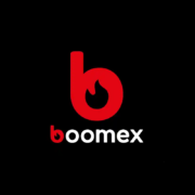
The new BOOMEX logo
The new BOOMEX logo – A symbol of success and quality, for 40 years and in the future
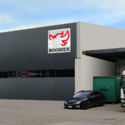
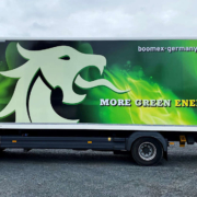
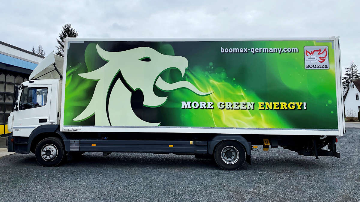
Our creative minds in the marketing team have designed the new BOOMEX logo, a symbol that is straightforward and highly recognizable. This is the right image for the leading producer and supplier of firelighters for barbecues, fireplaces, and stoves in Europe. BOOMEX represents a strong delivery performance, the well-known product quality, a solution-orientated service and a partnership-based treatment of our customers.
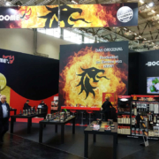
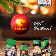
The logo represents what has characterized BOOMEX for 40 years: success and quality. FLASH is the house brand for all our products and has a convincing appearance at the point of sale. As the realization of our customers’ own brands is one of the great strengths of BOOMEX GmbH, FLASH does not play a role for every business contact. BOOMEX is the brand that all our customers recognize and with which we convince them.
Good readability and a high recognition value were particularly important to us when designing the new logo. The modern lettering does just that and supports our goal of representing BOOMEX clearly and directly. We are particularly proud of the red ‘b’, which not only stands for the flame that symbolizes our core theme, but can also be interpreted in many ways. Some see the symbol of a production plant in the letter, a traditional building with a chimney or even an oven. Thanks to its high recognition value, we can also use the ‘b’ on its own and present BOOMEX in a clear and striking way.
Everyone in the BOOMEX team makes a daily effort to contribute to the quality and reliability of BOOMEX, whether consciously or unconsciously. The logo is a symbol for the joint performance of our team and emphases our claim to further develop BOOMEX as a company and as a brand.
We look forward to moving into the future with this new logo. Together, we will continue our success story and tread new paths full of innovation and progress.

